Overview
Headers are the top navigation areas of your website that typically contain your logo, navigation menu, and important call-to-action buttons. With Tailwind CSS Builder, you can create fully custom headers using the visual builder instead of being limited to your theme's default header.
Custom headers give you complete control over:
- Layout - Position elements exactly where you want them
- Styling - Match your brand with custom colors, fonts, and spacing
- Responsive behavior - Design different layouts for mobile, tablet, and desktop
- Functionality - Add search, social icons, CTAs, and more
Use custom headers when you need more control than your theme provides, want to match a specific design, or need different headers for different sections of your site (e.g., a transparent header for landing pages).
Creating a Header
Follow these steps to create a new custom header:
- Navigate to TW Builder > Headers in your WordPress admin sidebar. This opens the Headers management area where you can see all your existing headers.
- Click "Add New Header" at the top of the page. This creates a new header post and prepares the builder.
- Give your header a name (e.g., "Main Site Header" or "Landing Page Header"). This name helps you identify the header when assigning it to pages.
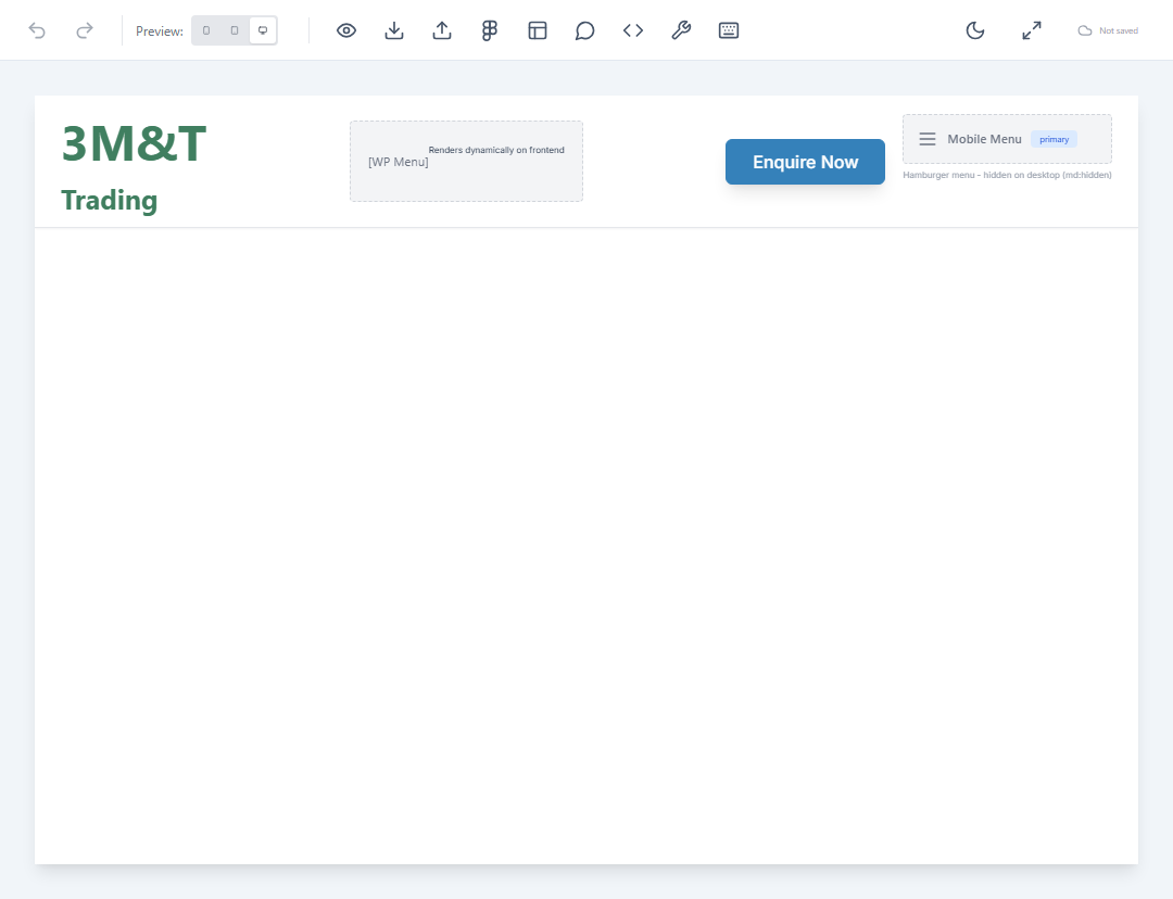
- The builder opens with a header-specific canvas. You'll see a horizontally-oriented workspace optimized for header design.
- Add elements from the element panel. Click the Elements button (or press E) to open the element panel and drag header elements onto the canvas.
- Arrange and style your header using the Inspector panel. Select elements to adjust their spacing, colors, typography, and responsive behavior.
- Save and publish your header by clicking Save in the bottom bar. Your header is now ready to be assigned to pages.
Header Elements
The following elements are commonly used when building headers. All standard elements are available, but these are specifically designed for header use cases:
| Element | Description | Common Use |
|---|---|---|
| Logo | Displays your site logo with automatic link to homepage. Supports both image logos and text-based logos. | Brand identity in top-left corner |
| WP Menu | Renders a WordPress navigation menu. Select from any menu registered in Appearance > Menus. | Main navigation links |
| Mobile Menu | Hamburger menu button that triggers a mobile-friendly navigation drawer. Shows only on smaller screens. | Mobile navigation toggle |
| Search | WordPress search form. Can be styled as a full input field or a collapsible icon. | Site search functionality |
| Button | Call-to-action button with customizable text, link, and styling. | Contact, Sign Up, or Get Started CTAs |
| Social Icons | Row of social media icons linking to your profiles. Supports all major platforms. | Social media links |
Use a Container with flex layout and justify-between to create the classic header pattern: logo on the left, navigation on the right. Add items-center to vertically center all elements.
Editing Headers
To edit an existing header:
- Go to TW Builder > Headers in your WordPress admin to see the list of all headers.
- Hover over the header you want to edit and click "Edit" (or click the header title directly).
- Make your changes in the visual builder. Add, remove, or restyle elements as needed.
- Click Save to update the header. Changes will immediately appear on all pages using this header.
Changes to a header affect all pages using it. If you need a different header for specific pages, create a new header variant instead of modifying the shared one.
Assignment Rules
Once you've created headers, you need to assign them to your pages. Headers follow a priority system that determines which header appears on each page.
For complete details on how header assignment works, including site-wide defaults, post type defaults, and page-specific overrides, see Settings > Header and Footer.
In brief, the assignment priority from highest to lowest is:
- Page-specific override - Header assigned directly to a page in its Page Settings
- Post type default - Header configured for all posts of a specific type
- Site-wide default - Header selected in TW Builder > Settings > Header/Footer
Tips and Best Practices
Sticky Headers
To create a header that stays visible as users scroll:
- Select your header's outermost container
- In Inspector > Position, set position to
stickyorfixed - Set
top: 0to pin it to the top of the viewport - Add a background color to prevent content from showing through
- Consider adding a subtle shadow (
shadow-md) for visual separation
Transparent Headers
For landing pages with hero images, a transparent header can look striking:
- Set the header background to
transparentor use a semi-transparent color - Use
absoluteorfixedpositioning so content flows behind the header - Ensure text contrast works against both the header area and underlying content
- Create a separate "Transparent Header" variant for these pages
Mobile-Responsive Headers
Headers need special attention on mobile devices:
- Use the Mobile Menu element instead of showing the full WP Menu on small screens
- Use responsive visibility classes to hide/show elements at different breakpoints
- Test your header using the device preview buttons in the builder toolbar
- Consider reducing logo size on mobile to save vertical space
- Ensure touch targets (buttons, links) are at least 44x44 pixels
Use Tailwind's responsive prefixes like hidden md:flex to show elements only on medium screens and above, or md:hidden to hide elements on larger screens. This is perfect for showing a hamburger menu on mobile but a full nav on desktop.