In this tutorial, you'll build a simple landing page with two sections: a Hero and a Features grid. You'll learn the core elements and workflow that apply to any page you build. By the end, you'll have a professional-looking page and the skills to create many more.
This tutorial takes approximately 10 minutes to complete. No prior experience required.
What You'll Build
By the end of this tutorial, you'll have created a landing page with two sections:
- Hero section - A full-width area with centered heading, tagline, and call-to-action button
- Features section - A 3-column grid showcasing benefits or features
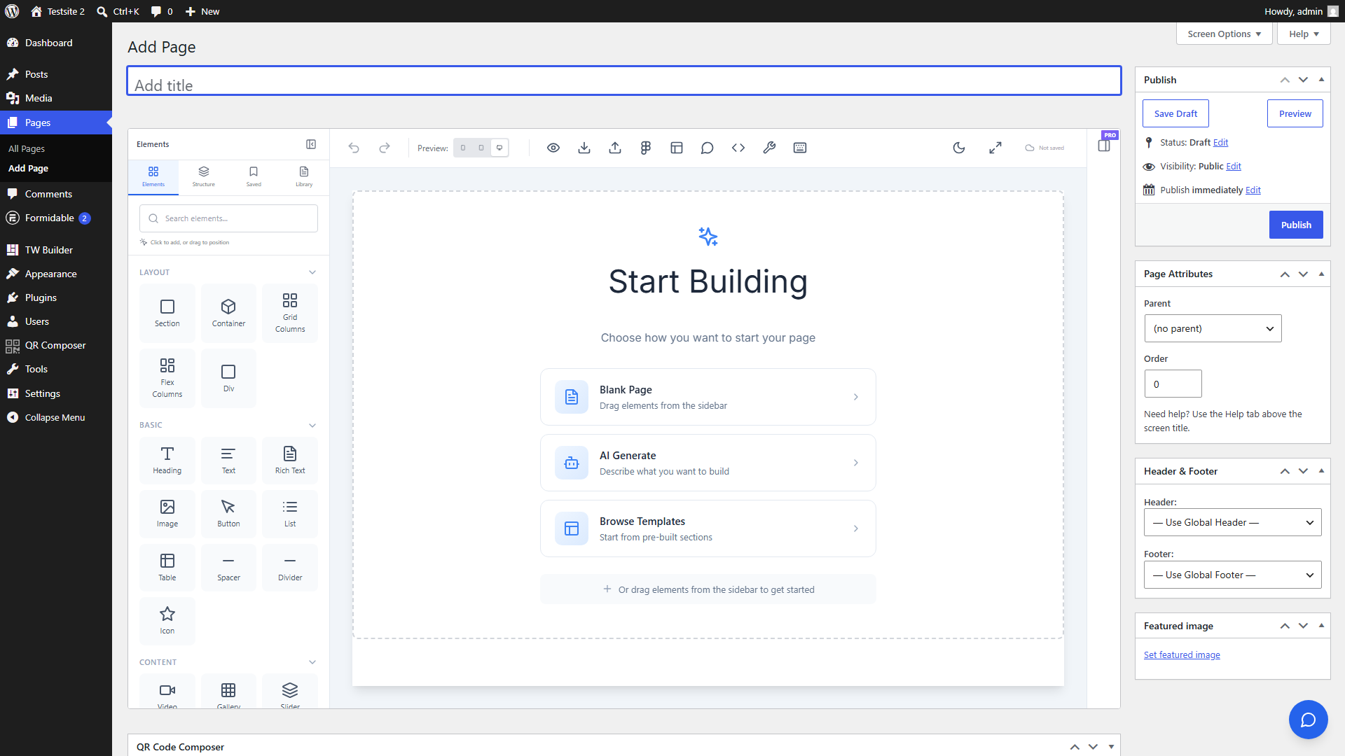
Step 1: Create a New Page
First, let's create a new WordPress page and open it in the builder:
- In WordPress admin, go to Pages > Add New - This creates a blank page for your landing page
- Give your page a title (e.g., "Landing Page") - This title appears in the browser tab and page URL
- Click the "Edit with Tailwind CSS Builder" button in the editor - You'll see this button in the top right area of the page editor
You can also access the builder from the Pages list by clicking the "TW Builder" link that appears when you hover over any page row.
Step 2: Build the Hero Section
Now let's add the elements that make up your Hero section. This is where visitors first land, so we'll make it eye-catching:
- Click "Elements" in the sidebar (or press E) - This opens the element panel on the left side
- Drag a "Section" element onto the canvas - Find Section under the "Layout" category. Sections are full-width containers that typically hold one logical part of your page
- With the Section selected, drag a "Container" inside it - Containers center your content and set a maximum width for readability
- Drag a "Heading" element into the Container - This will be your main headline
- Click the heading text and type your headline (e.g., "Build Websites Faster") - Just click directly on the text in the canvas to edit it
- Drag a "Text" element below the heading for your tagline - Text elements are for paragraphs and supporting content
- Edit the text content (e.g., "Create beautiful, responsive pages with our visual builder") - Click the text to edit inline
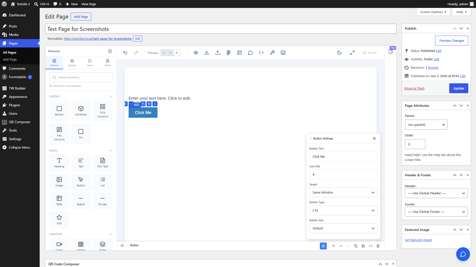
- Drag a "Button" element below the text - Buttons are for calls-to-action
- Edit the button text (e.g., "Get Started") - Click the button text to change it
Use the Inspector panel on the right to adjust spacing, colors, and typography. Select any element and the Inspector automatically shows its styling options.
Step 3: Style the Hero
Let's make the Hero section look professional with some quick styling:
- Select the Section - Click on the outermost element (the Section) and set a background color in Inspector > Background. Try a subtle gradient or solid color
-
Select the Container and set
text-centeralignment - This centers all the content inside - Select the Heading and increase font size in Inspector > Typography - Try 4xl or 5xl for a bold headline
- Add vertical padding to the Section - In Inspector > Spacing, add padding-top and padding-bottom (try py-16 or py-24 for generous spacing)
- Select the Button and choose a contrasting color - Make sure it stands out against the section background
Hold Shift while clicking to select multiple elements and style them together. This is useful when you want to apply the same spacing or typography to several elements at once.
Step 4: Add the Features Section
Now let's create a Features section below the Hero to showcase what your product or service offers:
- Drag another "Section" element below the Hero - This creates a new full-width area for your features
- Add a "Container" inside this new Section - Same as before, this centers and constrains the content width
- Add a "Heading" for the section title (e.g., "Features") - This introduces what the section is about
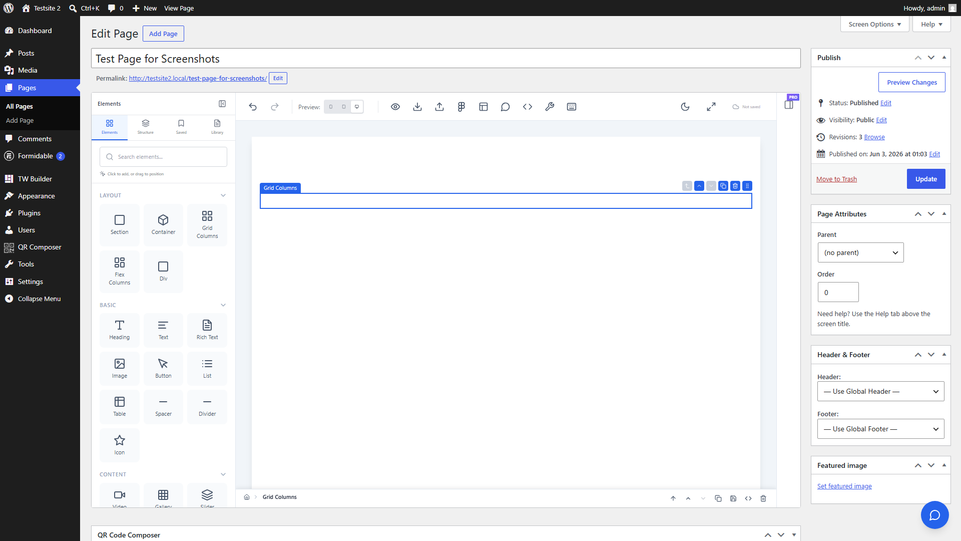
- Drag a "Grid Columns" element below the heading - Find this in the Layout category. Grid Columns creates a flexible multi-column layout
- In Inspector, set columns to 3 - Look for the Columns control in the Layout section of the Inspector
Grid Columns automatically creates a responsive layout. On mobile devices, the columns will stack vertically so your content remains readable on any screen size.
Step 5: Fill the Grid
The Grid Columns element automatically creates child column containers. Let's fill each column with feature content:
- Click the first column - The grid has 3 column children. Click inside the first one to select it
- Drag a "Heading" into the first column - In Inspector, change the tag to h3 for proper heading hierarchy
- Edit the heading text with your first feature title (e.g., "Easy to Use")
- Drag a "Text" element below for the feature description - Add a brief explanation of this feature
- Repeat for the second and third columns with different feature content
Copy and paste elements with Ctrl+C / Ctrl+V (or Cmd on Mac) to speed up repetitive work. Create one column's content perfectly, then duplicate it to the other columns and just change the text.
Step 6: Save and Preview
Your landing page is complete! Let's save it and see how it looks on the live site:
- Click the "Save" button in the bottom bar (or press Ctrl+S) - This saves all your changes to WordPress
- Click "Preview" to see your page on the frontend - This opens a new tab showing exactly how visitors will see your page
- Test responsive views using the device icons in the top toolbar - Click the tablet or mobile icon to see how your page looks on different screen sizes
You've built your first page with Tailwind CSS Builder! You now know how to use Sections, Containers, Headings, Text, Buttons, and Grid Columns - the core elements you'll use in almost every page.
The builder does not auto-save your work. Always click Save or press Ctrl+S before leaving the builder to avoid losing your changes.
Next Steps
Now that you've built your first page, here are some ways to continue learning:
- Learn more about the Builder Interface - Understand all the tools and panels available to you
- Explore all available Elements - Discover the 40+ elements you can use in your pages
- Customize your Global Styles - Set up your brand colors, fonts, and spacing system
With a Pro or Agency license, you can also use the AI Assistant to generate entire sections from text descriptions, or import designs directly from Figma.