Overview
Global Styles are the design foundation of your site. By defining colors, fonts, and spacing at the global level, you ensure visual consistency across every page you build. Changes to Global Styles automatically propagate throughout your site.
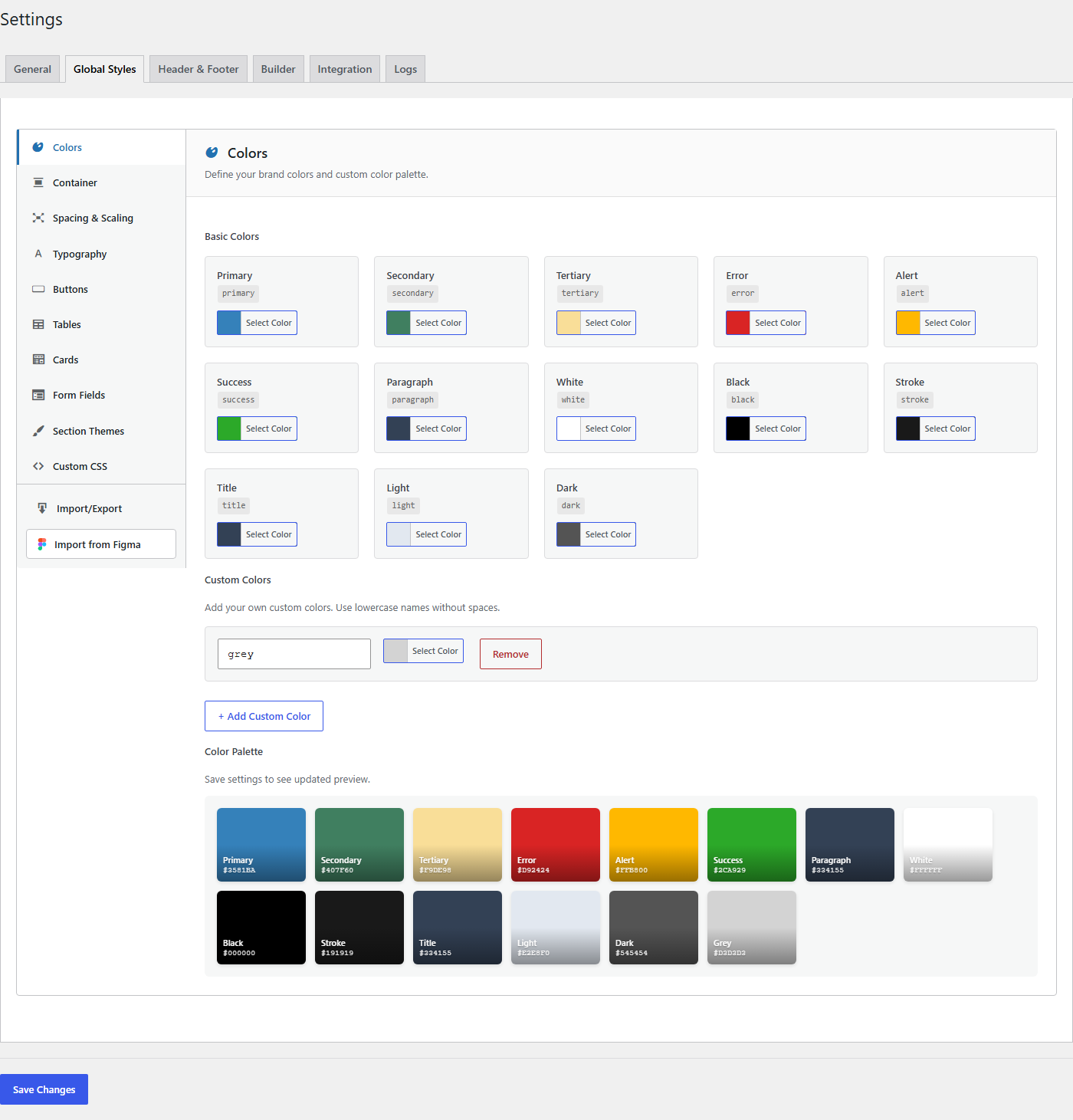
To access Global Styles, navigate to TW Builder > Settings and click the Global Styles tab.
Set up your Global Styles before building any pages. The colors and fonts you define here will appear in every color picker and font selector throughout the builder, making your design workflow significantly faster.
Colors
The Colors section defines your site's color palette. These colors appear in all color pickers throughout the builder, making it easy to maintain brand consistency.

Color Palette Settings
| Setting | Description | Default |
|---|---|---|
| Primary Color | Your main brand color. Used for buttons, links, and primary call-to-action elements. This is typically your logo's dominant color. | #0ea5e9 (Sky blue) |
| Secondary Color | Supporting brand color for secondary buttons, badges, and supporting UI elements. | #64748b (Slate) |
| Accent Color | Highlight color for special emphasis, notifications, or decorative elements. Use sparingly for maximum impact. | #f59e0b (Amber) |
| Background | Default page background color. Sections can override this with their own background colors. | #ffffff (White) |
| Background Alt | Alternate background color for visual separation between sections. Commonly used for alternating section backgrounds. | #f8fafc (Slate 50) |
| Text Color | Default text color for headings and body copy. | #0f172a (Slate 900) |
| Text Muted | Lighter text color for secondary text, captions, and helper text. | #64748b (Slate 500) |
Using the Color Picker
Click any color swatch to open the color picker. You can:
- Enter a hex value directly (e.g.,
#3b82f6) - Use the visual color picker to select a color
- Enter RGB or HSL values in the input field
- Copy a color from another application and paste the hex code
Dark Mode Colors
If your site supports dark mode, you can define alternate colors for dark theme. These appear when the user's system or browser preference is set to dark mode.
For proper dark mode support, consider choosing colors with good contrast. Text should remain readable against background colors in both light and dark themes.
Typography
The Typography section controls fonts and text styles across your site. Setting these globally ensures typographic consistency.
Font Family Settings
| Setting | Description | Default |
|---|---|---|
| Heading Font | Font family used for all heading elements (H1 through H6). Choose a font that matches your brand personality. | Inter |
| Body Font | Font family used for paragraphs, lists, and general text content. Prioritize readability for body text. | Inter |
| Mono Font | Monospace font for code blocks, preformatted text, and technical content. | JetBrains Mono |
Font Sources
The builder supports multiple font sources:
- Google Fonts - Over 1,500 free fonts. Select from the dropdown to automatically load the font.
- System Fonts - Fonts already installed on the user's device (Arial, Helvetica, Georgia, etc.). These load instantly with no external requests.
- Custom Fonts - Upload your own font files (WOFF, WOFF2) for complete brand control.
Font Size Scale
Define the base font sizes for your typography scale. These sizes are used as defaults when you add text elements:
| Setting | Description | Default |
|---|---|---|
| Base Font Size | The foundation of your type scale. All other sizes are relative to this value. | 16px (1rem) |
| H1 Size | Largest heading size, typically for page titles. | 2.25rem (36px) |
| H2 Size | Main section headings. | 1.875rem (30px) |
| H3 Size | Subsection headings. | 1.5rem (24px) |
| H4 Size | Smaller headings and card titles. | 1.25rem (20px) |
| Small Text | Captions, footnotes, and fine print. | 0.875rem (14px) |
Spacing
The Spacing section controls container widths and default padding values. These settings ensure consistent layout across different screen sizes.
Container Width Settings
Container width determines the maximum width of your content at each breakpoint. Content is centered within the viewport when it reaches maximum width.
| Breakpoint | Description | Default |
|---|---|---|
| SM (Small) | Maximum container width on small screens (mobile landscape) | 40rem (640px) |
| MD (Medium) | Maximum container width on medium screens (tablets) | 48rem (768px) |
| LG (Large) | Maximum container width on large screens (small desktops) | 64rem (1024px) |
| XL (Extra Large) | Maximum container width on extra large screens | 80rem (1280px) |
| 2XL (2X Large) | Maximum container width on very large screens | 96rem (1536px) |
Section Padding Defaults
Default vertical padding applied to new Section elements. You can override these on individual sections.
| Setting | Description | Default |
|---|---|---|
| Section Padding (Mobile) | Top and bottom padding for sections on mobile devices. | 3rem (48px) |
| Section Padding (Desktop) | Top and bottom padding for sections on desktop screens. | 5rem (80px) |
Container widths are used by the responsive preview in the builder. When you switch to Tablet view, the canvas constrains to the LG container width. Mobile view uses the SM container width.
Applying Changes
Global Style changes take effect in two ways:
New Elements
When you add a new element to a page, it automatically uses the current Global Styles. For example:
- A new Heading element uses the Heading Font
- A new Button uses the Primary Color as its background
- A new Section uses the default Section Padding
Existing Elements
Elements that reference Global Styles (using CSS variables like var(--tcb-primary)) update automatically when you change Global Styles. Elements with hard-coded colors or fonts are not affected.
Best Practices
- Start with Global Styles - Configure these settings before building pages to save time later
- Limit your palette - 3-5 colors is typically enough. Too many colors leads to visual inconsistency
- Test on mobile - Make sure font sizes are readable on small screens
- Use font pairs wisely - A contrasting heading and body font can add visual interest, but too much variety looks chaotic
- Consider accessibility - Ensure sufficient color contrast between text and backgrounds (WCAG recommends at least 4.5:1 for body text)