Overview
Saved Components let you capture any combination of elements and reuse them across your pages. Instead of rebuilding the same design patterns from scratch, you can save a group of elements as a component and insert it anywhere with a single click or drag.
Components are ideal for design patterns you use repeatedly:
- Card layouts - Testimonial cards, feature cards, pricing cards
- Call-to-action blocks - Newsletter signups, contact prompts, download sections
- Content patterns - Author boxes, related posts sections, social proof blocks
- UI elements - Custom buttons with icons, decorated headings, badge groups
Components are smaller, reusable pieces - think of them as building blocks. Templates are full pre-built sections (hero sections, feature grids, pricing tables) available from the Template Library. Use components for your own custom patterns; use templates for starting points from the library.
Saved Components require an Agency license. This feature is part of the Agency plan which includes the component library, site templates, and other advanced features.
Creating a Component
Follow these steps to save elements as a reusable component:
- Select the element(s) you want to save - Click on an element in the canvas to select it. To select multiple elements, hold Shift while clicking additional elements. You can also select a parent container to save it with all its children.
- Right-click to open the context menu - With your element(s) selected, right-click anywhere on the selection. This opens the element context menu with various actions.
- Click "Save as Component" - Find and click the "Save as Component" option in the context menu. This opens the component naming dialog.
- Enter a descriptive name - Give your component a clear, descriptive name that will help you identify it later. For example: "Testimonial Card - Light", "CTA Block - Newsletter", or "Feature Icon Box".
- Confirm to save - Click Save or press Enter. Your component is now stored in your component library and appears in the Saved tab of the element panel.
You can also access "Save as Component" from the bottom bar when an element is selected. Look for the "Save as Component" button next to other element actions.
Using Components
Once you've saved components, inserting them into your pages is quick and easy:
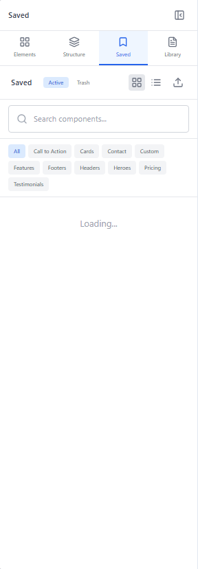
- Open the Saved panel - Click the "Saved" icon in the sidebar element panel, or press S on your keyboard to quickly open it. This shows all your saved components.
- Browse your components - Your saved components appear as cards with their names. If you have many components, use the search bar at the top to filter by name.
- Insert a component - Click on a component card to insert it at the end of your canvas, or drag it to a specific location where you want it placed.
- Edit as needed - The inserted component becomes regular elements that you can edit freely. Change text, colors, images, or any other properties to fit the specific page.
Components are copied when inserted, not linked. Changes you make to an inserted component do not affect the saved version, and updates to the saved component do not propagate to previously inserted instances. Each insertion is independent.
Component Library
The component library (Saved panel) helps you organize and manage all your saved components:
View Modes
Toggle between two display modes for your component library:
- Grid view - Shows components as cards in a grid layout. Best when you have visual thumbnails and want to browse quickly.
- List view - Shows components in a compact vertical list. Best when you have many components and want to see more names at once.
Searching Components
Use the search bar at the top of the Saved panel to filter components by name. As you type, only matching components are displayed. This is especially useful when you have a large library of saved components.
Managing Components
To manage your saved components:
- Delete a component - Hover over a component card and click the trash icon to remove it from your library. This action cannot be undone.
- Rename a component - Right-click on a component card and select "Rename" to update its name. Clear names make your library easier to navigate.
Deleting a component removes it permanently from your library. Components that have already been inserted into pages are not affected - they remain as regular elements. Only the saved template in your library is removed.
Drag and Drop
The drag and drop workflow lets you place components exactly where you want them:
- Open the Saved panel - Click the Saved icon in the sidebar or press S to open your component library.
- Click and drag a component - Click on any component card and begin dragging. The component preview follows your cursor.
- Position over the canvas - As you drag over the canvas, drop indicators appear showing valid drop zones. Blue lines indicate where the component will be inserted.
- Release to insert - When the drop indicator shows your desired position, release the mouse button. The component elements are inserted at that location.
- Edit as regular elements - The inserted component is now part of your page. Select any element within it to customize text, styling, or structure.
Drop indicators appear between elements and inside containers. You can drop components at the root level of the canvas, inside sections, or within any container element that accepts children.
Best Practices
Follow these tips to get the most out of saved components:
Naming Conventions
Use descriptive, consistent names that help you find components quickly:
- Include the type - Start with what it is: "Card - Testimonial", "CTA - Newsletter", "Hero - Centered"
- Add variants - If you have variations, indicate them: "Button - Primary Large", "Button - Secondary Small"
- Use prefixes for organization - Group related components: "Blog - Author Box", "Blog - Related Posts", "Blog - Share Buttons"
What to Save as Components
Good candidates for components include:
- Design patterns used on 3+ pages
- Complex layouts that are tedious to rebuild
- Brand-specific elements like styled headings or CTAs
- Interactive patterns like accordion items or card layouts
Updating Components
Since components are not linked after insertion, updating a component requires:
- Create or modify an instance of the component on a page
- Delete the old component from the library (Saved panel)
- Save the updated version as a new component with the same name
Consider creating a dedicated "Component Library" page that's not published. Use it as a workspace to design, refine, and save your components. This gives you a central place to maintain your component designs.
Keep Components Flexible
Design components to be adaptable:
- Use relative sizing (percentages, rem) instead of fixed pixels where possible
- Avoid content-specific text - use placeholder text that reminds you to customize
- Test components at different container widths before saving
- Include responsive classes so components work on all screen sizes