Overview
The Builder Settings panel controls the page builder's interface, behavior, and features. Here you can customize which elements are available, set canvas preferences, configure auto-save behavior, and enable advanced features like animations and AI assistance.
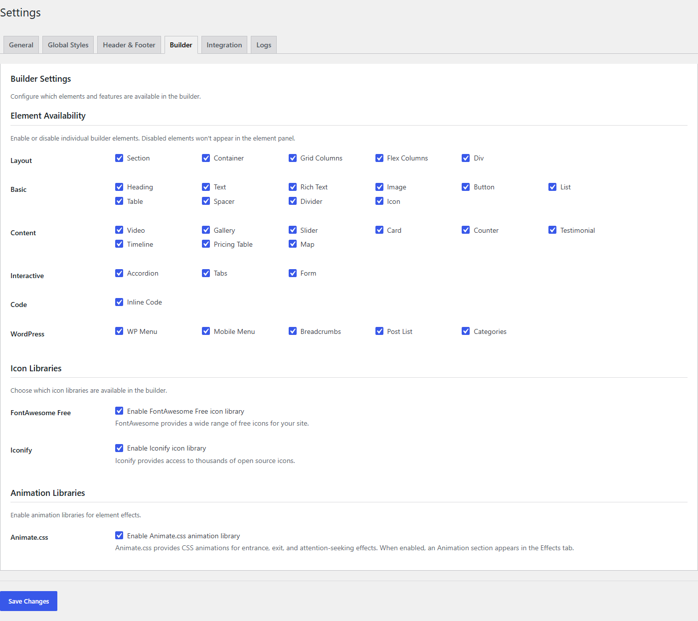
To access Builder Settings, navigate to TW Builder > Settings and click the Builder tab.
Element Visibility
Control which element categories appear in the builder's sidebar. This is useful for simplifying the interface for specific users or restricting access to certain element types.
Toggle the checkbox next to each category to show or hide it in the element panel:
| Category | Elements Included | Default |
|---|---|---|
| Layout | Section, Container, Grid Columns, Flex Columns, Div | Enabled |
| Basic | Heading, Text, Rich Text, Image, Button, List, Table, Spacer, Divider, Icon | Enabled |
| Content | Video, Gallery, Slider, Card, Counter, Testimonial, Timeline, Pricing Table, Map | Enabled |
| Interactive | Accordion, Tabs, Form | Enabled |
| Code | Inline Code, PHP Code, PHP If/Else, PHP Foreach, PHP While, PHP Switch | Enabled |
| WordPress | WP Menu, Mobile Menu, Breadcrumbs, Post List, Categories | Enabled |
Hiding an element category only removes it from the sidebar. Elements of that type that are already on a page will continue to work normally and can still be edited.
When to Hide Categories
- Simplify the interface - If you only build simple pages, hide categories you don't use
- Restrict code elements - Hide the Code category to prevent non-developers from adding PHP
- Focus on content - Hide Layout and Interactive if content editors only need basic elements
- Premium elements - Some Content and Interactive elements require a Pro license
Canvas Preferences
Customize how the editing canvas behaves and appears.
| Setting | Description | Default |
|---|---|---|
| Default Breakpoint | Which device view to show when opening the builder. Choose Desktop, Tablet, or Mobile. | Desktop |
| Show Grid Lines | Display alignment guides on the canvas when hovering over elements. Helps with precise positioning. | Disabled |
| Canvas Background | Background color/pattern for the canvas area outside your page content. Doesn't affect the actual page. | Checkerboard |
| Zoom Level | Default zoom level when opening the builder (50% - 200%). | 100% |
Default Breakpoint
The Default Breakpoint setting determines which responsive view loads when you first open a page in the builder:
- Desktop - Full-width view, best for designing desktop layouts first
- Tablet - Medium-width view, useful if you primarily design for tablet users
- Mobile - Narrow view, ideal for mobile-first design approach
You can always switch breakpoints using the device icons in the top toolbar. This setting just controls the starting view.
Show Grid Lines
When enabled, grid lines appear when you hover over or select elements. These visual guides help you:
- Align elements precisely
- See the boundaries of containers and sections
- Understand the layout structure of nested elements
Auto-save Settings
Configure how frequently the builder automatically saves your work.
| Setting | Description | Default |
|---|---|---|
| Auto-save Interval | How often to automatically save your work. Options: 1, 2, 5, or 10 minutes, or Disabled. | 2 minutes |
| Show Save Indicator | Display a "Last saved" timestamp in the toolbar showing when the page was last saved. | Enabled |
Choosing an Interval
- 1 minute - Maximum protection against losing work. Good for unstable connections.
- 2 minutes - Balanced default. Frequent enough to protect work without excessive saving.
- 5 minutes - Lighter on server resources. Good for sites with many concurrent editors.
- 10 minutes - Minimal auto-save. Relies on manual saves.
- Disabled - No auto-save. You must manually save all changes. Use with caution.
If you disable auto-save, remember to manually save your work frequently using Ctrl+S (Windows) or Cmd+S (Mac). Unsaved changes will be lost if you close the browser or navigate away.
Advanced Options
Enable or disable advanced builder features.
| Setting | Description | Default |
|---|---|---|
| Enable Animations | Enable the Animation panel in the Inspector for adding CSS animations (Animate.css) to elements. When enabled, the Animate.css library is loaded on the frontend for pages with animations. | Disabled |
| Enable AI Assistant | Show the AI chat panel for generating page sections and content. Requires an API key to be configured in Integrations. | Disabled |
| Dark Mode | Use dark color scheme for the builder interface. Matches your system preference by default. | System |
Enable Animations
When animations are enabled, you can add entrance animations, hover effects, and scroll-triggered animations to any element using the Effects panel in the Inspector.
Available animation types include:
- Entrance animations - Fade in, slide in, bounce, zoom, etc.
- Scroll-triggered - Animations that play when the element enters the viewport
- Hover effects - Animations triggered by mouse hover
- Duration and delay - Customize timing for each animation
The Animation system requires a Pro or Agency license. After enabling this option, the Effects panel will appear in the Inspector when you select an element.
Enable AI Assistant
The AI Assistant helps you build pages faster by generating section layouts and content based on your descriptions. When enabled:
- An AI chat panel appears in the left sidebar
- You can describe what you want to build in natural language
- The AI generates responsive sections with proper Tailwind styling
- Generated content can be inserted directly onto your page
Before enabling, make sure you've configured at least one AI provider (OpenAI, Anthropic, or Google) in the Integrations settings.
Dark Mode Options
The Dark Mode setting controls the builder interface appearance:
- System - Follows your operating system's dark mode setting
- Light - Always use the light theme
- Dark - Always use the dark theme
This setting only affects the builder interface, not your actual page content or the frontend of your site.
Saving Settings
Click the Save Settings button at the bottom of the panel to apply your changes. Changes take effect immediately for new builder sessions. If you have the builder open in another tab, refresh that tab to see the changes.